Buttons
Buttons
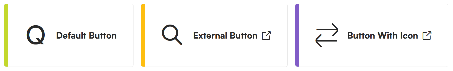
Button types
The button block is a specific type of link that can be used as a standalone item rather than inline hyperlink text with a body of copy.
Default Buttons

Outline Buttons

Plain Buttons

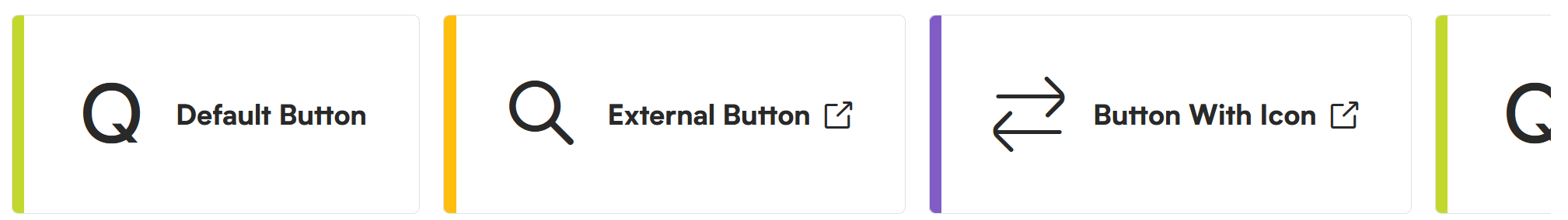
Small Quick Link Buttons

Large Quick Link Buttons
Large Quick Link, Scrollable
Tips
Try not to mix too many button styles. Be mindful of its current page and the existing styles when adding additional button types.
Using the block in WordPress
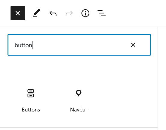
Adding a block to the page
To add the buttons block, toggle the block inserter and search for the block named buttons. For more information on adding blocks see Getting Started.
Editing
Default button when added to the page.

Example of editing text directly on the button.

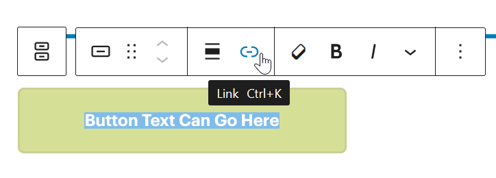
Adding a link
To add a link to a button, select the button text then hit the link button to begin adding the link to the element.
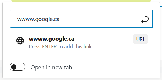
From here you can either link to a page by typing the page name or a specific URL. Hitting return will save the link address. Toggling Open in new tab will open the link in a new tab as opposed to the current tab.
Tips
Best practice is to open links in new tabs when they are external to the current website. For example, if the link was not hosted on the IHPME website.
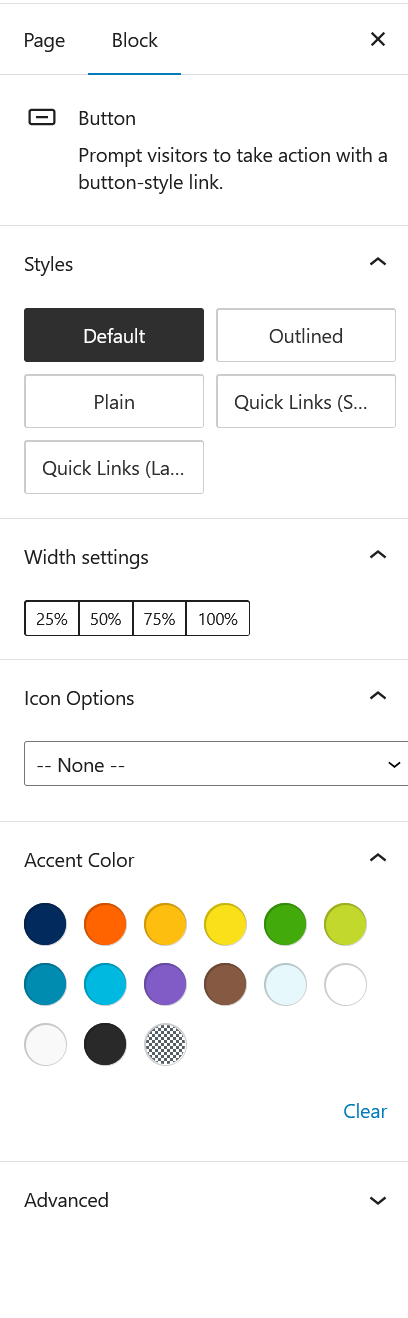
Configuration options
When the buttons block is selected in the WordPress editor, the right-hand sidebar will display the follow configuration options:
- Style
- Default: Standard button style with full colour
- Outline: No fill colour. Only 1px outline border surrounding the button
- Plain: No surrounding fill or border
- Quick links small: Use when creating quick links to other areas
- Quick links large: For creating large quick links often in root areas within the website
- Width Settings
- 25%: Spans 1/4 the width of the container
- 50%: Spans 1/2 the width of the container
- 75%: Spans 3/4 the width of the container
- 100%: Spans the full width of the container
- Icon Options
- Select an icon to accompany the block from the available predefined set
- Accent Colour
- Predefined accent colours from the IHPME colour palette
Configuration panel